ShopDreamUp AI ArtDreamUp

Deviation Actions


Description
Yes! I am at it again! I've relaunched my project to fund for my manga's printing! You can check it out here: kck.st/12Om142 I offer artsy rewards there too! I'm currently 101% FUNDED! Thanks so much! (will update the percentage often)
I offer a lot of great rewards this time! Making it a smaller project this time, but if I reach above my goal, then it'll be much better! That way, I can go to conventions and stuff too!
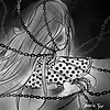
I've always pictured painting this within my head so I'm glad I was able to do so this time!
 (Thank you!)
Rose (left) and Alice Desangi (right) © to me
Tools Used: Paint Tool Sai and Photoshop
Time Taken: 1 Day
Before you critique, I do have the knowledge of anatomy. I've taken courses in college and am a graduate. I've taken figure drawing classes to study anatomy for years. I do use my own models to study from as my knowledge from that course. What I am trying to do is stylize the characters as a mixture of realism and cartoon.
-----------------------
Read for free beginning here: tapastic.com/series/389
MangaMagazine: www.mangamagazine.net/manga-an…
Club: 
Follow me on Tumblr: remoteangel.tumblr.com
FAQ: remoteangel.deviantart.com/jou…
Commissions: remoteangel.deviantart.com/jou…
Twitter: twitter.com/remoteangel
Image size
4000x3000px 21.13 MB
Comments133
Join the community to add your comment. Already a deviant? Log In
This piece is excellently done. It's a nice and simple depiction of a hero and her nemesis. The poses are appropriate and convey the characters well. I would also add that the background and accompaniment are also very insightful and true to the characters' personalities and represent who they are and what they stand for in a very clear and concise way. If I really HAVE to say something critical I think the transition from one character's side to the other should have more of a gradient transition, but that's admittedly being very nit picky. Overall, this piece is very well done!